
More sales from the traffic you already have
The most famous checkout A/B test of all time showed a 21.8% lift for one page. Then the largest checkout research body on the planet spent a decade explaining why that number does not mean what everyone thinks it means.
Every few months a store owner asks me the same question, usually right after a competitor relaunches with a slick single-page checkout: should we collapse our checkout into one page? It is a fair question with a famous answer and a much less famous correction, and this entry is my attempt to put both on the same page of the diary, because the famous answer keeps getting quoted alone.
In 2010 the team at Elastic Path ran an A/B test on the checkout of the official Vancouver 2010 Olympic Store. The original multi-step flow went up against a newly designed single-page checkout, and the single page won by 21.8%. That number has been doing laps around the CRO world ever since. It shows up in vendor decks, in app store listings for one-page checkout plugins, and in half the blog posts this article competes with.
Here is what quotes rarely include. The test ended with 606 transactions total, roughly 300 per variant, which is a thin base for a number cited to one decimal place. And the author of the original writeup said plainly that the result should not be used to predict how every single-page checkout will perform. The winning variant was not just shorter. It was a fresh design replacing an out-of-the-box platform checkout, so the test compared an optimized page against a default one, with the page count along for the ride.
A year later Baymard Institute, which has since logged over 200,000 hours of checkout UX research and benchmarked 334 top-grossing US and EU sites, published its response to the one-page enthusiasm. Their testing found that users in general had few problems navigating between multiple steps. The usability disasters they observed came from what the customer had to do at each step, not from how many steps existed. Their conclusion was that if you took the same form fields and split them across two sensible pages, you would see little if any difference in completion rates.
That reframes the Olympic Store result completely. The single page did not win because it was single. It won because someone finally designed the checkout instead of shipping the default.
Page count is the most visible property of a checkout and one of the least important. The form is the product. The pagination is the binding.
Baymard’s abandonment statistics, averaged across 50 studies, put overall cart abandonment at 70.22%. When shoppers who were genuinely trying to buy are asked why they quit, the checkout length problem is real but far from first. 39% cite extra costs like shipping and fees, 19% were forced to create an account, 19% did not trust the site with their card, and only 18% say the checkout was too long or complicated.
So the layout debate addresses the fourth item on the list. The bigger levers sit upstream of any pagination decision, and they survive a relayout untouched. A one-page checkout that reveals a shipping fee at the end is a shorter path to the same exit.
There is one number in Baymard’s data that speaks directly to the length complaint, and it is not about pages. The average US checkout displays 23.48 form elements by default. Their ideal checkout gets down to 12 to 14 elements, which is about 7 to 8 actual input fields. That is the real gap between the average checkout and a good one: almost half the interface is deadweight, whichever way you paginate it.
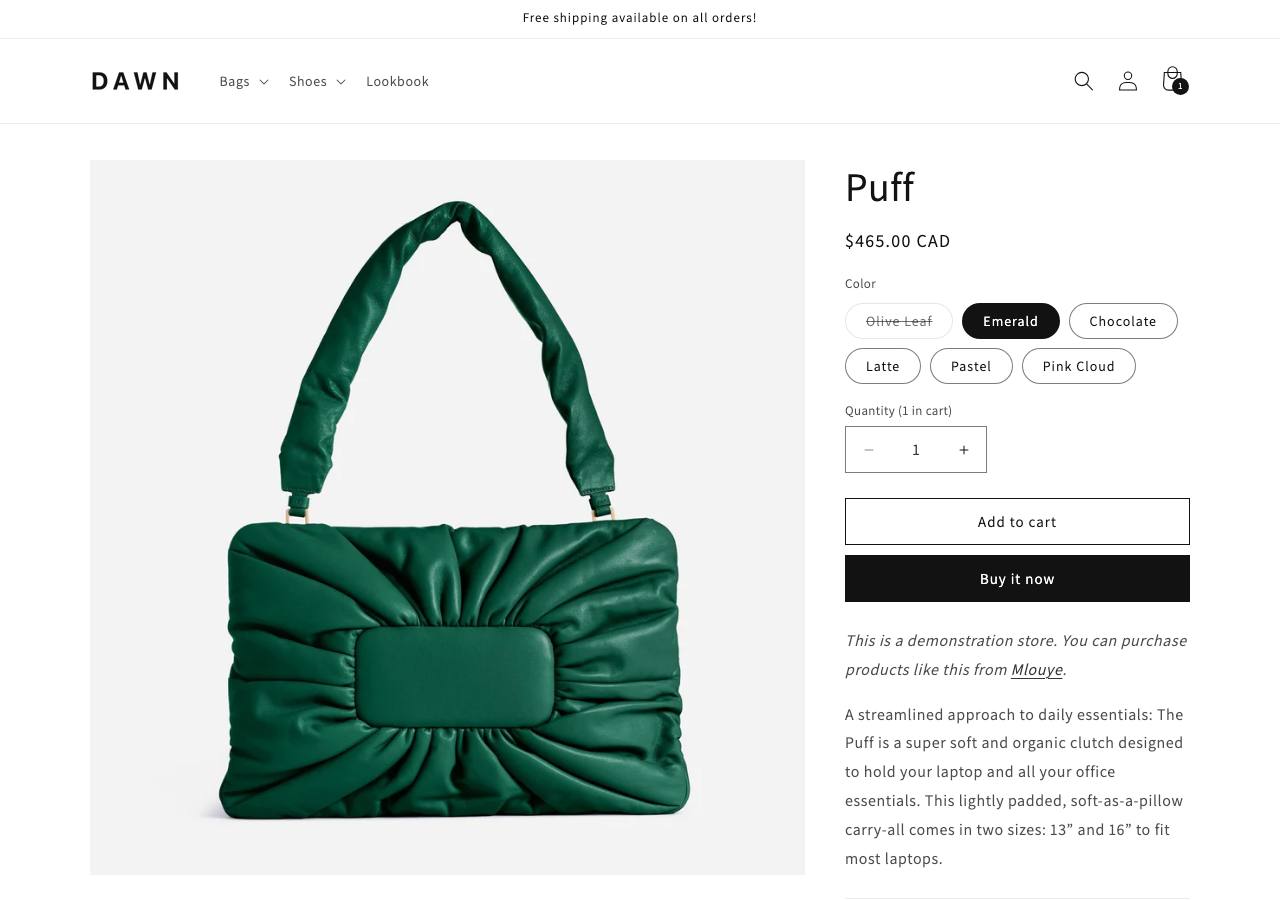
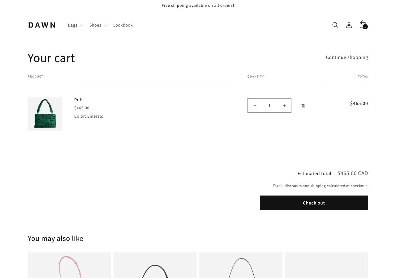
Here is the part the layout debate keeps skipping: go and look at a real checkout instead of arguing about it. The three shots below are from Shopify’s own Dawn demo store, walked from the product page to the payment step in a real browser. Nothing is drawn or mocked up.
The cart is the last calm screen before the money conversation, and it hides the thing Baymard says matters most.
Then the checkout itself, and this is the detail almost every version of this debate misses.
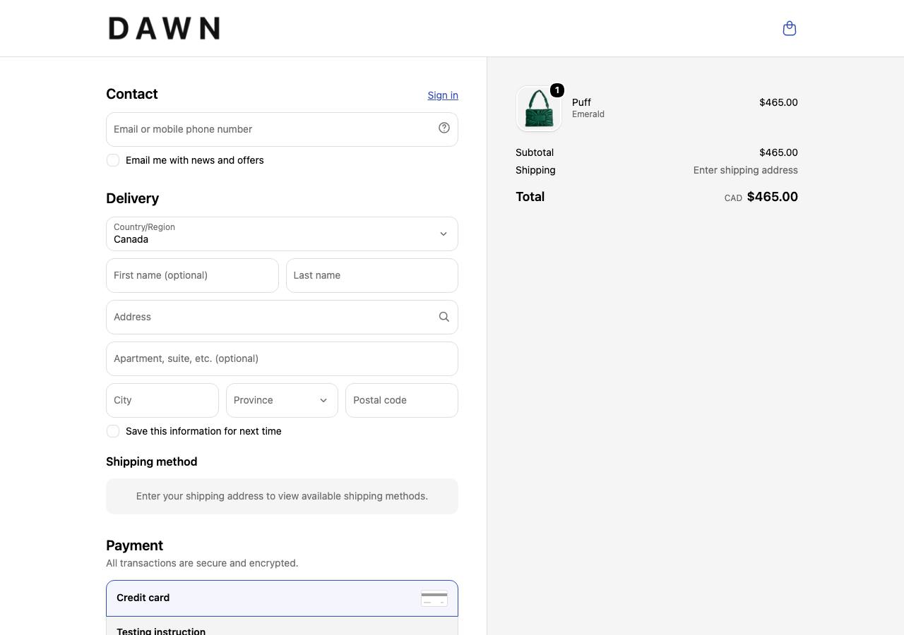
So the modern question is not one page against many pages. Shopify already picked one page for you and gave you no switch to flip. What you can still control is how heavy that page is, and the demo above answers it by asking for almost nothing. The friction points to watch are all inside a single scroll now: the empty email field at the top, the shipping cost that only resolves after an address goes in, and the payment block waiting at the bottom. Those are the places I put my analytics, because that is where the drop-off hides.
After all of that, the layouts are not identical twins. There are real differences, they are just smaller than the debate suggests, and they cut both ways.
A single page suits small carts and simple products, where a customer with a saved address and a wallet app can be done in under a minute. It also imposes useful discipline. Baymard made this point too: committing to one page forces the team to fight over every field, and the fields lose. The layout is a diet plan as much as a design.
Multi-step suits anything with decisions inside it, like shipping options, gift notes, or several payment paths. Each step carries one question, errors surface next to the step that caused them, and progress feels legible. And there is a practical measurement bonus I lean on constantly: distinct steps give you distinct analytics events, so I can see exactly where people stall. A one-page checkout often reports itself as a single event, which turns diagnosis into archaeology.
For scale on what a normal flow loses, Littledata’s benchmark of 2,800 ecommerce sites puts the average Shopify checkout completion rate at 45%, with the best 10% of stores above 66%. More than half the people who start a typical checkout do not finish it. That is the pool both layouts are fishing in.
I keep this comparison pinned in the diary. Click any column heading to sort the rows, so you can group by who wins or read it criterion by criterion. Watch how few of these edges are large. That is the whole point.
| Criterion | One-page checkout | Multi-step checkout | Edge |
|---|---|---|---|
| Perceived length | Feels like one short task | Reads as several small tasks | One-page |
| Form error visibility | An error can scroll out of view | Each error sits beside its step | Multi-step |
| Mobile friction | One long scroll, fewer taps | Short screens, more taps | Even |
| Analytics granularity | Often one event, hard to diagnose | Distinct step events show the stall | Multi-step |
| Page loads to finish | One load, nothing to wait for | A fresh load between each step | One-page |
| Field discipline | Forces the team to cut fields | Easy to hide bloat across steps | One-page |
| Shipping and payment choices | All crammed onto one screen | Each choice gets its own step | Multi-step |
| Speed for a saved-wallet buyer | Done in under a minute | Extra taps before the pay button | One-page |
The marker-yellow cell in each row is the side that wins that line. Tally the column and it is close, which is exactly why I stopped treating page count as the big lever.
If a store asked me to run this experiment tomorrow, my honest sequence would ignore the layout at first. Kill the surprise costs, show shipping early, open guest checkout, and delete every field that does not earn its place against Baymard’s 12 to 14 element ideal. Those moves attack the 39% and the 19% and most of the 18% all at once, and none of them require touching pagination.
Then, if the appetite for a layout test is still there, run it, with a sample size that would survive scrutiny, which means thousands of transactions and not six hundred. My prediction, and the published record backs it, is a small result in either direction. The stores that win at checkout are not the ones that found the magic page count. They are the ones that made the form so light that the page count stopped being a question worth asking.
The screenshots are real. I loaded Shopify's public Dawn demo store, added one in-stock item to the cart through a direct cart permalink, and walked it to the hosted checkout in a headless Chromium browser at a 1280 by 900 desktop viewport on 15 July 2026. Nothing is a mockup. The checkout in that last shot is the same one Shopify serves to a live shopper on the Dawn theme.
The numbers come from published work, not from my own client data. The 21.8% figure is Elastic Path's 2010 A/B test on the Vancouver Olympic Store, 606 transactions in total. The abandonment reasons and the 23.48 form-element average are Baymard Institute's, drawn from their large-scale checkout usability research. The 45% completion benchmark is Littledata's, across roughly 2,800 stores. Every link sits in the sources list below.
The comparison table is my own read of those sources plus years of watching real funnels stall. I kept the edges small on purpose. Anyone who tells you one layout wins by double digits is usually selling a checkout plugin.
Published research says the question itself is slightly wrong. Baymard's testing found users had few problems moving between steps, and that abandonment comes from what each step demands, not from how many URLs the flow spans. The same lean form works well in both layouts, and the same bloated form fails in both.
That was Elastic Path's 2010 A/B test on the official Vancouver Olympic Store, 606 transactions in total. It is a real published result, but the author himself wrote that it should not be used to predict how every single-page checkout will perform. The redesigned page was also simply better optimized, not just shorter.
Baymard measured that the average US checkout displays 23.48 form elements by default, while an ideal checkout can get down to 12 to 14 elements, which is roughly 7 to 8 actual input fields. Cutting the surplus matters more than merging pages.
Only after you have removed the known killers: surprise costs, forced account creation, and redundant fields. Testing layout while 39% of your abandoners are reacting to shipping fees is testing the wallpaper while the kitchen is on fire.