
More sales from the traffic you already have
Every lever in this playbook comes with a published receipt: Baymard's abandonment numbers, the Renault and Vodafone speed studies, the 300 million dollar guest checkout story. No folklore, no 'we tested it on a client', just the evidence and the order I would pull the levers in.
“How do I increase my conversion rate” is the most searched question in this trade and the most badly answered, because most answers are lists of forty tips with no evidence attached, sorted by ease of writing rather than size of effect. This playbook is shorter and stricter: every lever must have a published number behind it, and the levers are ordered the way I would actually pull them.
| # | Lever | The published receipt | Effort |
|---|---|---|---|
| 1 | Reveal full costs early | 39% of US abandoners cite unexpected extra costs (Baymard) | Settings |
| 2 | Guest checkout by default | Purchasing customers up 45% when the register wall fell (Spool) | Settings |
| 3 | Cut checkout form fields | Ideal 12 to 14 elements vs 23.48 average; 18% abandon long checkouts (Baymard) | Hours |
| 4 | Real-user speed under 2.5s LCP | 13% conversions per second (Renault); 8% sales in an A/B test (Vodafone) | Days |
| 5 | Trust at the payment moment | 19% distrust with card details, 15% cite returns policy (Baymard) | Hours |
| 6 | Payment method coverage | 10% abandon for missing payment methods (Baymard) | Settings |
| 7 | Theme baseline and built-ins | Measurable LCP gaps between Theme Store themes (Storefront Daily) | Budget |
Everything below is the reasoning per row.
The top of the playbook is all checkout, because checkout is where every visitor has already said yes to the product. Baymard’s survey ranks the self-inflicted wounds precisely: 39% of US abandoners left because extra costs were too high or surprising, 19% because the site demanded an account, 18% because the process was too long, against an average US checkout of 23.48 form elements where 12 to 14 would do. Their overall estimate: an average 35.26% conversion upside for large sites from checkout design alone.
The guest checkout row deserves its legend told straight, because it is the single best documented conversion fix in the literature. In Jared Spool’s field study of a major retailer, usability tests showed first-time buyers resenting the register wall (“I’m not here to enter into a relationship”) and repeat customers failing their own passwords, 160,000 password resets a day, 75% of which never returned to buy. The fix was one button: Register became Continue. Purchasing customers rose 45%, an extra 15 million dollars the first month, 300 million dollars over the year. On Shopify, the equivalent is a checkbox: accounts optional.
Shopify’s own checkout does a lot of this right by default, which is worth seeing once with your own eyes. Here is the stock checkout of the free Dawn theme’s demo store, captured this July:
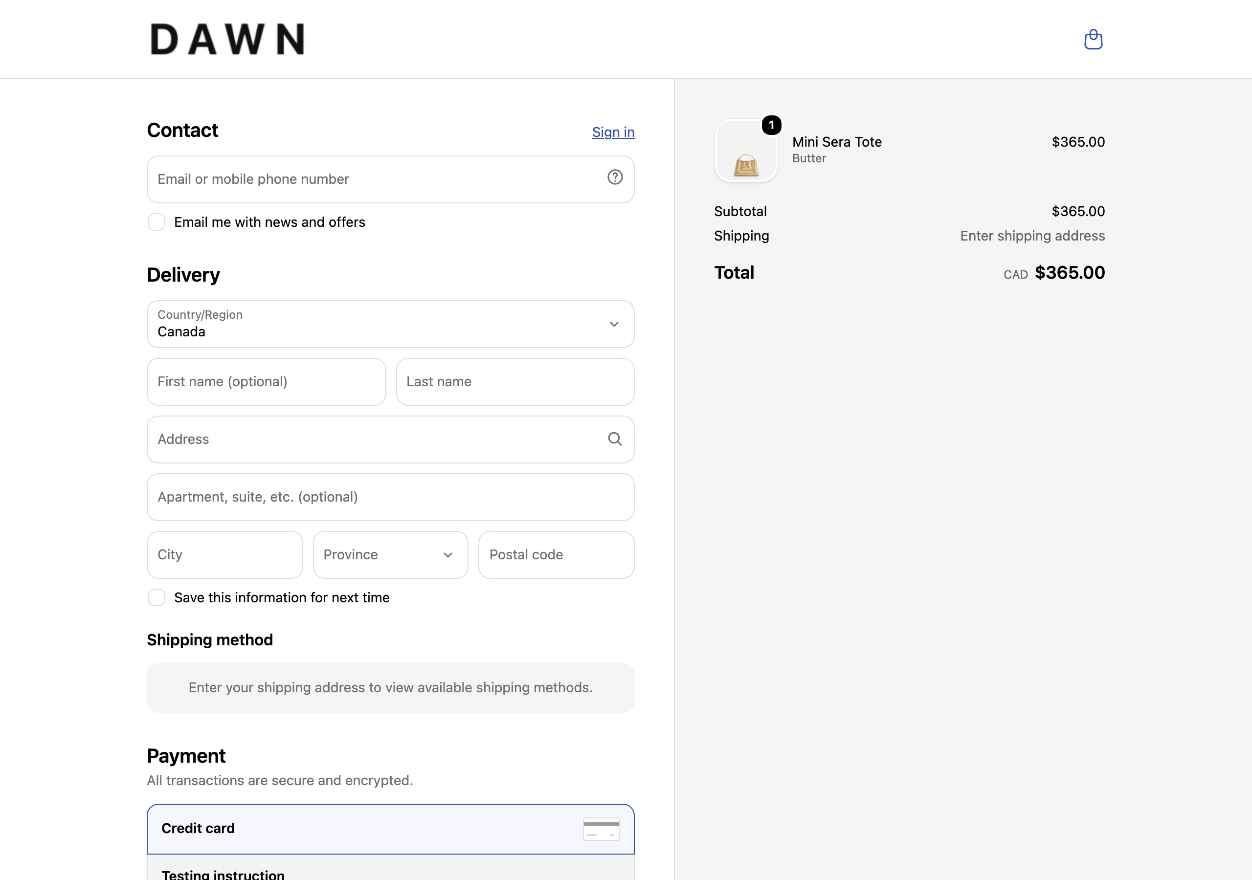
The leaks I actually find on live stores are almost always store-inflicted: account requirement switched on deliberately, a phone field made mandatory for a newsletter nobody asked for, shipping costs hidden until the last step because “the rates embarrass us”. The playbook move is subtraction.
The speed literature is unusually good because it includes a true A/B test. Renault’s 10-million-visit analysis tied one second of LCP improvement to 13% more conversions. Vodafone served two versions of the same page differing only in performance: the one with 31% better LCP sold 8% more. Deloitte’s 37-site study associated a 0.1 second improvement with 8.4% more retail conversions.
On Shopify the sequence is: measure field data first (the CrUX method from my 90-day roadmap), then images, then the app audit, then what remains is your theme’s baseline.
Trust is checked at the exact screen where the card number gets typed: real payment logos, a human-written returns policy one tap away (15% of abandoners cite returns terms), no surprise line items. Payment coverage is a checklist: Shop Pay, Apple Pay, Google Pay, PayPal switched on, because 10% of abandoners could not pay the way they wanted.
The theme is last not because it is small but because it is the only row that costs money. It sets your speed floor and decides which conversion mechanics, sticky carts, quick buy, visible stock states, exist without app weight. Storefront Daily’s speed report measured real LCP differences between official Theme Store themes, and theme vendors with public catalogs, UTD’s themes among them, can be speed-checked via CrUX and PSI before you spend, using exactly the same instruments as everything else here.
Inclusion rule: a lever enters only with a published, citable number from a named study, survey or benchmark, read by me in July 2026, with URL and date in the sources list. Excluded by this rule: urgency timers, social proof widgets, AI recommendations and most popup lore, not because they never work but because the public evidence for them is thin or vendor-published without methodology. The effort column is my judgment from doing these tasks on Shopify stores, marked as opinion. No client data, no composite anecdotes, and no numbers of mine appear anywhere in this entry.
Subtraction first, physics second, persuasion last. Most stores run this list backwards, which is why most CRO disappoints.
If you only remember one thing: the levers at the top act on people who already decided to buy and merely need you to stop stopping them. The levers further down recruit new decisions, which is harder and noisier. Pull them in order, one per two-week window, log everything, and re-benchmark at quarter’s end against Littledata’s thresholds: 1.4% is average, 3.2% is the top fifth, 4.7% is the top tenth. That is the whole game.
In order of published evidence: showing full costs early instead of springing shipping at the last step, defaulting to guest checkout, cutting checkout form fields toward Baymard's ideal of 12 to 14 elements, improving real-user speed past the 2.5 second LCP threshold, making returns and payment trust visible at the moment of payment, and only then persuasion-layer work like popups and urgency.
Leak removals act immediately on the people already trying to buy: someone who would have abandoned at a surprise fee today simply does not abandon tomorrow. Speed work also pays from the day it ships. What takes time is measuring the effect honestly, which needs at least two clean weeks per change on a small store.
For the core playbook, no. Cost transparency, guest checkout, field count and image discipline are settings and housekeeping. The place money legitimately enters is the theme baseline, since a slow or feature-poor theme caps everything downstream, and formal A/B testing tools once your traffic can feed them.
Littledata's benchmark of 2,800 sites puts the Shopify average at 1.4%, the top 20% above 3.2% and the top 10% above 4.7%. Aiming from average into the top fifth is a realistic multi-quarter goal; tripling overnight is not, and playbooks promising it are selling something.